Graphique Pro
Posted: October 30, 2012 Filed under: finds: something new Leave a commentI’ve been using Netflix for a while now and it was bothering me what font it was, so I did some research and turns out it is Graphique Pro.
About this font family
Graphique was originally created by Swiss designer Hermann Eidenbenz in 1945, and issued as hot metal font by Haas’sche Schriftgießerei, Switzerland.
German type designer Ralph M. Unger digitally remastered and expanded the typeface for profonts, and the digital OTF Pro version comprises of more than 400 characters including the complete Latin and Cyrillic glyph sets.
Graphique Pro is a Caps-only font as outline shadow, very narrow, very economic, and thus, ideally suited for headlines, posters, signs, CD-covers, book titles and a lot more.
Other info
- Designers: Hermann Eidenbenz,Ralph M. Unger
- Design date: 2008
- Publisher: profonts
Ampersand Project
Posted: October 22, 2012 Filed under: finds: something new 2 CommentsWe looked at a bunch of different ampersands in class, and I found this one — I feel like it’d be a fun project to design our own considering all the variations that could be done.
The Frutigers.
Posted: October 9, 2012 Filed under: Sitings of Our Classic Fonts Leave a commentAlong with Led Zeppelin and a barrage of hippies, the 1970’s brought us one of the world’s most understated classic fonts: Frutiger.
Created by Swiss designer, Adrian Frutiger, the typeface was first commissioned for private use by the Charles de Gualle International Airport in France in the late 1960s. However, the sans serif was found to be easy to read, proportional, and legible in both large and small formats, and was released as a font family to the public in 1976.
The font is used most notably in academia and transportation industries. As an element in contemporary graphic design, Frutiger gives the impression of cleanliness and ease-of-use. Here are a few examples of it in use.
Amtrak’s logo.
 BART: Bay Area Rapid Transport, the San Francisco area’s subway.
Logo of Flickr, popular photo-sharing website.
Official logo of prog-rock band, Muse.
The U.S. Park Service’s official typeface? Who knew.
So, there you have it: ambiguous, ever-classy Frutiger.
Optima !
Posted: October 9, 2012 Filed under: Looks like a Letter Leave a commentI grew up seeing the Estee Lauder logo because it’s my moms favorite brand of makeup. I did the linocut project on Optima so it’s been extra prevalent in my head. Even though I haven’t been exposed as much to capital letters in this font, they are still pretty recognizable by the sleek form and slightly concave terminals. Estee Lauder not only uses Optima in their company name, but also in many of their ads. The font was created in 1953 by Hermann Zapf in Germany.
Helvetica- Spotted everywhere
Posted: October 9, 2012 Filed under: Looks like a Letter Leave a commentI was booking my flights for spring break when I realized the font used on the website as well as in their logo is Helvetica. American Airlines has a simple, clean cut logo, which Helvetica is perfect for in that case.
For simplicity with logo design it is often better to go with a simple sans serif typeface. That is why it is such a popular typeface when it comes to logo design.
I started noticing it more and more, like on my North Face jacket and decided to do a little research to see where else I most likely see it everyday, without notice. Here are 40 common logos using Helvetica:
http://www.webdesignerdepot.com/2009/03/40-excellent-logos-created-with-helvetica/
Bodoni vs. Onyx
Posted: October 8, 2012 Filed under: Sitings of Our Classic Fonts Leave a commentIn honor of being a Nirvana fan for 10 years, I decided to do a blog on the font. I know the PDF about Bodoni on ANGEL has the Nirvana logo as Bodoni, but it really is Onyx. I found this out when I was a teenager when trying to find the font for it. The difference between Onyx and Bodoni is that Onyx’s letters are tracked closer to each other. It does raise the question if the Nirvana logo started out as Bodoni artificially tracked closer, and after seeing the logo, someone made the font to be like that. I also use Onyx for my personal logo.

Highway Fonts
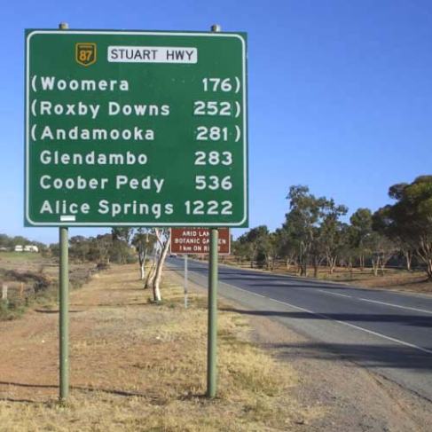
Posted: October 8, 2012 Filed under: Looks like a Letter Leave a commentOn my ride back to Oneonta from home, I couldn’t help but wonder about the font seen all over the country on big green signs. The road signs on the highway all have the same font that is a sans-serif informally known as “Highway Gothic.” It is otherwise known as “FHWA series fonts.” It was a typeface designed to be legible while driving at high speeds. The typefaces originated from FHWA’s Standard Alphabets for Traffic-Control Devices, originally published in 1945 (reprinted 1952). The designer is Ted Forbes. Different variations of this font series are used in the U.S. and in other countries such as Canada, Brazil and many more. This font can also be affiliated with “The Weather Channel”, The New York Mets, and The TV Guide Channel. I find it interesting that something such as a font has become so worldwide and has remained its consistency for the most part.
-Michelle Furman
Paris
Posted: October 6, 2012 Filed under: finds: something new Leave a comment
I found this while browsing Pinterest — I checked out all the letters, some of the lowercase ones I’m not to fond of but I think a lot of them are very uniquely done.
Sweet Sans pro
Posted: October 6, 2012 Filed under: finds: something new Leave a commentI was in Ballston Spa over break and I spotted this Salon – Make Me Fabulous – and the logo intrigued me and trying to find out what font it was DROVE me insane. At first it looked like Helvetica to me but the tie of the E’s and F’s weren’t right, but I am pretty sure I have identified it as Sweet Sans Pro.
Information on Sweet Sans Pro:
The engraver’s sans serif—strikingly similar to drafting alphabets of the early 1900s—has been one of the most widely used stationer’s lettering styles since about 1900. Its open, simple forms offer legibility at very small sizes.
- Designers: Mark van Bronkhorst
- Design date: 2011
You will see this font every time you get your Pumpkin Latte fix
Posted: October 5, 2012 Filed under: Looks like a Letter Leave a commentSo i was going to dunkin donut to get their amazing pumpkin lattes, since it is fall, i thought i might get one. So i wondered what font the logo was since i have never seen anyone else use it. I thought the font would be hard to find. But it was quite easy
Its Frankfurter!!!!
it was designed by Alan meeks. Its chunky and round form is perfect for a place that sells donuts or hot dogs?
YAY my first post on the blog! Go Amber 🙂


