Classic font sitings!
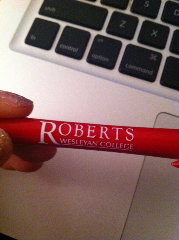
Posted: December 12, 2012 Filed under: Sitings of Our Classic Fonts Leave a commentAs I was was studying for finals, I noticed the pen I am using has a classic font we learned about in class. This one is definitely Adobe Garamond. I recognized it due to the sloping tail on the “R.”
This next classic font I spotted is Futura due to the pointy san serif type! This is one of my favorite fonts. It is clean, geometrical, and modern. This picture is my laptop case!

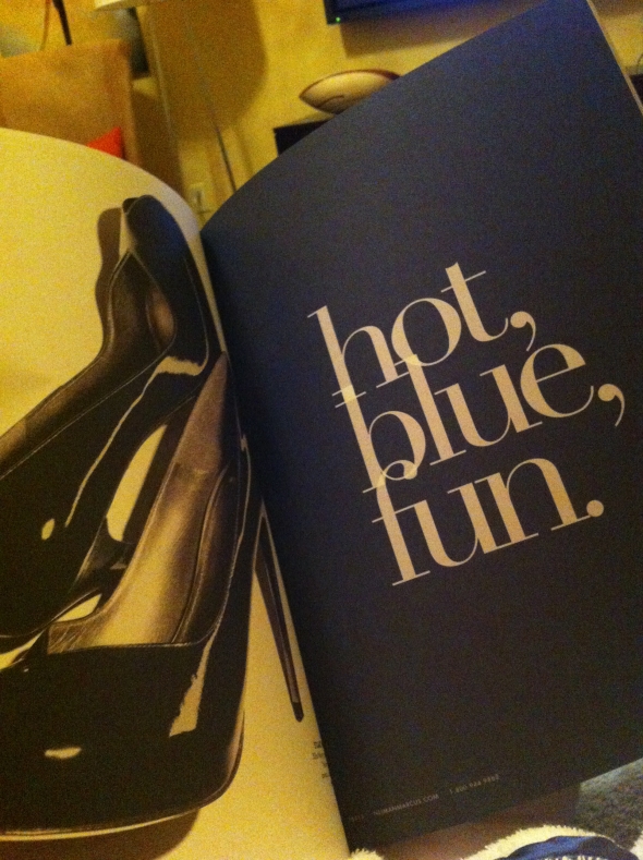
I spotted another font when flipping through a Neiman Marcus catalog. This font looks just like Bodoni! The only letter that looks different to me is the “t,” but the designer could have made adjustments. This font is beautiful, and definitely works best in a large size because of the thin hairline strokes.