
Sex (Didot) and the City
Posted: December 13, 2012 Filed under: Sitings of Our Classic Fonts Leave a comment ![]()
At first glance the font used looks a lot like Bodoni, but it is actually Didot.


About this font family
The Didot family were active as designers for about 100 years in the 18th and 19th centuries. They were printers, publishers, typeface designers, inventors and intellectuals. Around 1800 the Didot family owned the most important print shop and font foundry in France. Pierre Didot, the printer, published a document with the typefaces of his brother, Firmin Didot, the typeface designer. The strong clear forms of this alphabet display objective, rational characteristics and are representative of the time and philosophy of the Enlightenment. Adrian Frutiger’s Didot is a sensitive interpretation of the French Modern Face Didot. Another model for this design is the Henriade, an historical printing of the original Didot from 1818. The font Didot gives text a classic and elegant feel.
Classic font sitings!
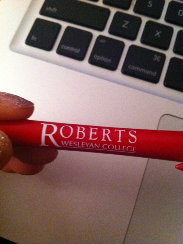
Posted: December 12, 2012 Filed under: Sitings of Our Classic Fonts Leave a commentAs I was was studying for finals, I noticed the pen I am using has a classic font we learned about in class. This one is definitely Adobe Garamond. I recognized it due to the sloping tail on the “R.”
This next classic font I spotted is Futura due to the pointy san serif type! This is one of my favorite fonts. It is clean, geometrical, and modern. This picture is my laptop case!
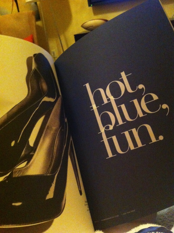
I spotted another font when flipping through a Neiman Marcus catalog. This font looks just like Bodoni! The only letter that looks different to me is the “t,” but the designer could have made adjustments. This font is beautiful, and definitely works best in a large size because of the thin hairline strokes.
Time magazine font
Posted: December 8, 2012 Filed under: Sitings of Our Classic Fonts Leave a commentI have to brag about my great grandfather getting into my last semester’s Art and Scope. I did this on my (too much) free time in September as a birthday gift for my dad. The hardest part of this design was inserting the TIME logo, and here is the reason why.
After almost 90 years of being in use, the font is the copyrighted font Wellsbrook Initials SG Heavy, meaning it costs $39 to download. There was no way I’m paying that much money for a font that I will only use once in my life, so what I did was I took a picture of the logo and deleted the white space.

Siting of Franklin Gothic
Posted: December 8, 2012 Filed under: Sitings of Our Classic Fonts Leave a comment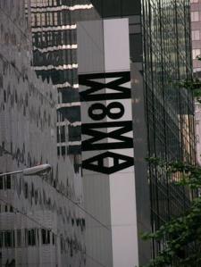
The MOMA is not only one of my favorite places to go, but I am also a member. As I was cleaning out my wallet this morning, I realized that I had seen the font before.
Helvetica
Posted: December 7, 2012 Filed under: Sitings of Our Classic Fonts Leave a commentSaw this on Yahoo’s Best/Worst Movie Posters of the year, and this was one of the worst posters of the year and I agree. The title of the film is completely overpowering this poster, even though I do appreciate the use of Helvetica.

Bodoni Sighting!
Posted: December 6, 2012 Filed under: Sitings of Our Classic Fonts Leave a commentWhile looking for the Macy’s Parade this year, look what I found!

(I’m almost positive that the lettering on Bloomingdale’s “Designer Handbag Sale” is Bodoni, but there’s always the possibility it’s one of the Fake Bodonis; like Didot)
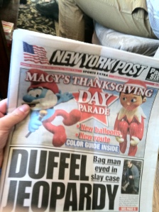
NY Post for the win.
Harry Potter Font
Posted: November 1, 2012 Filed under: Sitings of Our Classic Fonts 1 CommentSince I started reading Harry Potter in 3rd grade, I’ve never once thought about what the actual typeface is. I know that the title font was created specifically for the books, but the actual type used in the books is Adobe Garamond 12pt.


The Frutigers.
Posted: October 9, 2012 Filed under: Sitings of Our Classic Fonts Leave a commentAlong with Led Zeppelin and a barrage of hippies, the 1970’s brought us one of the world’s most understated classic fonts: Frutiger.
Created by Swiss designer, Adrian Frutiger, the typeface was first commissioned for private use by the Charles de Gualle International Airport in France in the late 1960s. However, the sans serif was found to be easy to read, proportional, and legible in both large and small formats, and was released as a font family to the public in 1976.
 (Frutiger Himself.)
The font is used most notably in academia and transportation industries. As an element in contemporary graphic design, Frutiger gives the impression of cleanliness and ease-of-use. Here are a few examples of it in use.
![]()
Amtrak’s logo.
![]() BART: Bay Area Rapid Transport, the San Francisco area’s subway.
BART: Bay Area Rapid Transport, the San Francisco area’s subway.

Logo of Flickr, popular photo-sharing website.

Official logo of prog-rock band, Muse.

The U.S. Park Service’s official typeface? Who knew.
So, there you have it: ambiguous, ever-classy Frutiger.
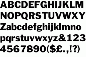
Bodoni vs. Onyx
Posted: October 8, 2012 Filed under: Sitings of Our Classic Fonts Leave a commentIn honor of being a Nirvana fan for 10 years, I decided to do a blog on the font. I know the PDF about Bodoni on ANGEL has the Nirvana logo as Bodoni, but it really is Onyx. I found this out when I was a teenager when trying to find the font for it. The difference between Onyx and Bodoni is that Onyx’s letters are tracked closer to each other. It does raise the question if the Nirvana logo started out as Bodoni artificially tracked closer, and after seeing the logo, someone made the font to be like that. I also use Onyx for my personal logo.
![]()
![]()
Baskerville
Posted: October 5, 2012 Filed under: Sitings of Our Classic Fonts Leave a commentI got my blood drawn over break and as I was leaving I noticed a certain letter that stood out to me on the back of the door. It was the “Q” that I recognized and I knew that it was no font other than Baskerville!!!

