
SEVENLY
Posted: December 8, 2012 Filed under: finds: something new, Something one should know about Leave a commentI am a huge supporter of non profit organizations and charities, seventy.org makes it easier to learn about non profit organizations and I could find interesting shirts and designs supporting the group.
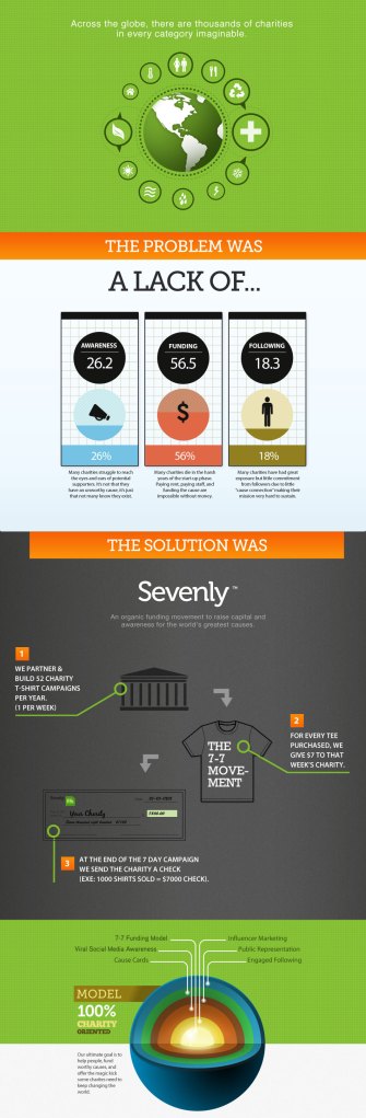
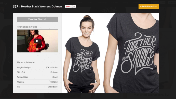
The designs are mainly typographic and I feel they are a new way of using typography.
Tumblr logo
Posted: December 8, 2012 Filed under: finds: something new Leave a comment
It’s finals time, and what is better than procrastinating? Tumblr is my major outlet for procrastinating. I am on this site all the time and decided I should figure out the font for the logo.
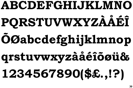
I found that the font used for the Tumblr logo, Bookman Old Style.
I love that the typeface is very old, but in the logo, it looks so new.
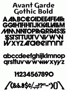
TWLOHA uses Advant Garde Gothic Bold and Alternate letters
Posted: December 8, 2012 Filed under: Looks like a Letter Leave a comment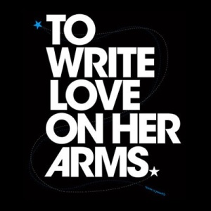

Upon my search for charities for me to donate to this holiday season, I realized that some of the letters in the logo were familiar. After searching, I realized that there were regular letters and alternate letters/glyphs of Advant Garde Gothic Bold.
Siting of Franklin Gothic
Posted: December 8, 2012 Filed under: Sitings of Our Classic Fonts Leave a comment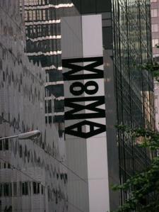
The MOMA is not only one of my favorite places to go, but I am also a member. As I was cleaning out my wallet this morning, I realized that I had seen the font before.
Mentalist posters on campus
Posted: December 1, 2012 Filed under: Looks like a Letter Leave a commentI keep seeing these posters around campus and I was super happy to realize that they use quicksand. Quicksand is round and delicate. When bold, the roundness is emphasized.

Type Sighting!: Law and Order SVU
Posted: September 24, 2012 Filed under: Looks like a Letter Leave a comment
In one of the episodes, I noticed a familiar font…. Book Antiqua. The lowercase t was a dead give away.

